hw7
约 236 个字 242 行代码 10 张图片 预计阅读时间 4 分钟
Problem 1
给定dataframe
df=pd.DataFrame({"vals": np.random.RandomState(31).randint(-30, 30, size=15), "grps":np.random.RandomState(31).choice(["A", "B"], 15)})
给df新增一列patched_vals, 如果vals相应行非负,则patched_vals等于vals,否则等于组平均值(按照grps分组)。
Python
import pandas as pd
import numpy as np


df = pd.DataFrame({"vals": np.random.RandomState(31).randint(-30, 30, size = 15),
                   "grps": np.random.RandomState(31).choice(["A", "B"], 15)})


# 计算每组的平均值
group_means = df.groupby("grps")["vals"].transform("mean")


# 创建新列 patched_vals
df["patched_vals"] = df.apply(lambda row: row["vals"] if row["vals"] >= 0 else group_means[row.name], axis=1)


# 美观起见,重置索引从1开始
df = df.reset_index(drop=True)
df.index = df.index + 1


print(df)
1 2 3 4 5 6 7 8 9 10 11 12 13 14 15 16 | |
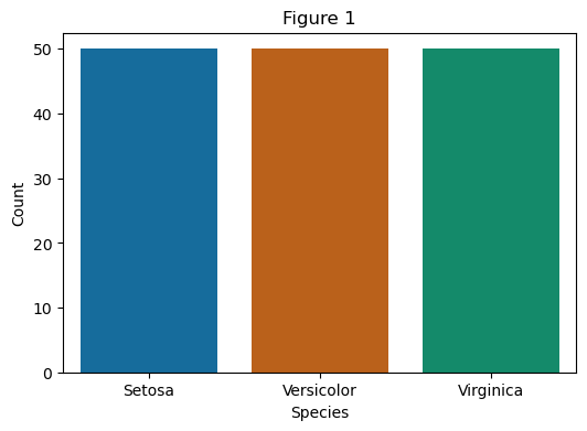
Problem 2
使用iris数据集分别创建如下图形:
Python
# 导入需要的库和魔术命令
import pandas as pd
import matplotlib.pyplot as plt
import seaborn as sns
%matplotlib inline


# 读取数据集
df = pd.read_csv("iris.csv")
Python
# Figure 1 Count Plot
# 绘制计数图
df = df.rename(columns={"variety": "species"})
plt.figure(figsize=(6, 4))
# 修改颜色
palette_colors1 = ["#0072B2", "#D55E00", "#009E73"]
sns.countplot(data = df, x = "species", hue = "species", palette = palette_colors1, legend = False)
plt.title("Figure 1")
plt.xlabel("Species")
plt.ylabel("Count")
plt.show()
Python
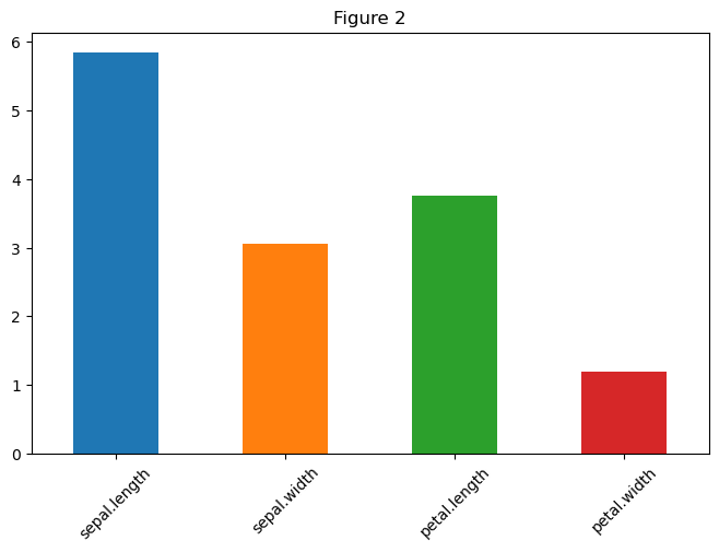
# Figure 2 Bar plot
# 猜测应该是前四个列的平均值的直方图
# 先求平均值:提取前四列 mean计算均值
features = df.columns[:4]
avg = df[features].mean()
# 颜色列表
colors = ['#1f77b4', '#ff7f0e', '#2ca02c', '#d62728']

# 使用pandas接口
avg.plot(
    kind = "bar",
    figsize = (8, 5),
    color = colors,
    # 旋转操作
    rot = 45  # 自动旋转x轴标签
)


# 添加标题和标签(比原生Pandas图更清晰)
plt.title("Figure 2")


plt.show()
Python
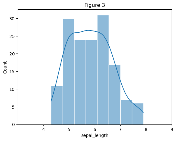
# Figure 3 核密度估计图和直方图
# 绘制直方图与核密度曲线(kde=True 显示曲线)
# 使用seaborn新的方法histplot
sns.histplot(
    data = df,
    x = "sepal.length",
    kde = True,
    edgecolor = "white",
    # 猜测给出的应该是8个
    bins = 8,
    color = "#1f77b4",
)

# 为了更贴合样例选择修改起止区间
plt.xlim(3, 9)
# x轴显示0到9,左侧留白0-4
# 设置x轴刻度(仅显示4及以上的数字,4以下无刻度)
xticks_positions = range(4, 10)  # 刻度位置:4,5,6,7,8,9
plt.xticks(xticks_positions)     # 仅在这些位置显示数字


# 设置坐标轴标签和标题
plt.xlabel("sepal_length")
plt.title("Figure 3")

# 显示图形
plt.show()
Python
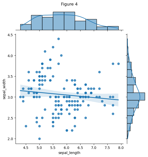
# Figure 4 Jointplot
g = sns.jointplot(
    data = df,
    x = "sepal.length",
    y = "sepal.width",
    kind = "reg",
    color = "#1f77b4"
)


plt.xlabel("sepal_length")
plt.ylabel("sepal_width")
# 控制高度 避免覆盖
plt.title("Figure 4", y = 1.24)

# 显示图形
plt.show()
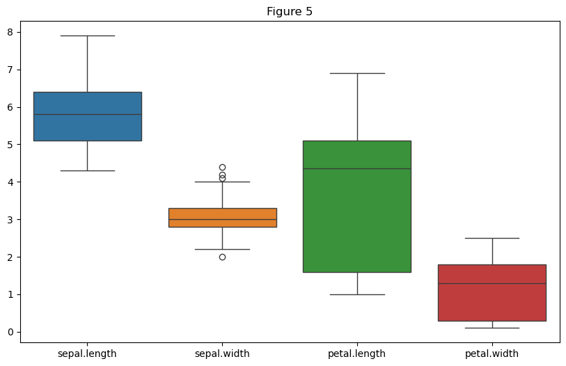
Python
# Figure 5 Box plot
# 绘制箱线图
first_four_cols = df.iloc[:, :4]

# 绘制箱线图
plt.figure(figsize = (10, 6))
sns.boxplot(data = first_four_cols)

# 设置标题和坐标轴标签
plt.title("Figure 5")


# 显示图形
plt.show()
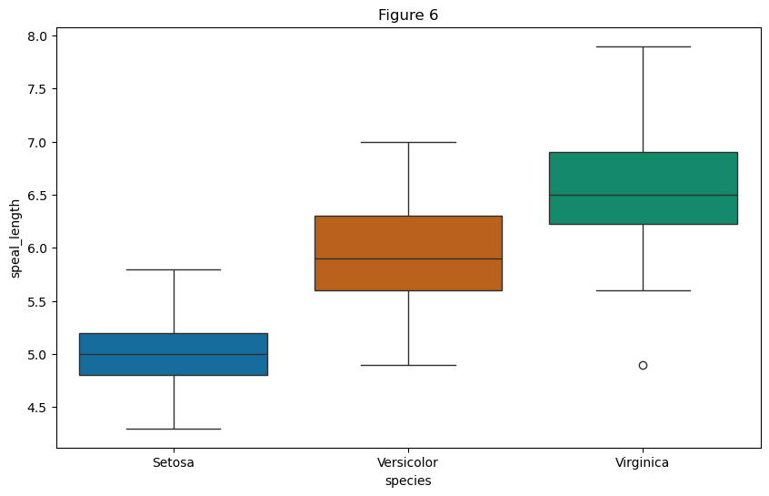
Python
# Figure 6 Box plot
# 绘制箱线图
plt.figure(figsize = (10, 6))
palette_colors1 = ["#0072B2", "#D55E00", "#009E73"]
sns.boxplot(x = df.columns[-1], hue = df.columns[-1], y="sepal.length", data = df, palette = palette_colors1, legend = False)

# 设置标题和坐标轴标签
plt.title("Figure 6")
plt.xlabel("species")
plt.ylabel("speal_length")

# 显示图形
plt.show()
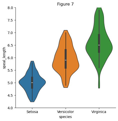
Python
# Figure 7 Violin plot
# 忽略提示
import warnings
warnings.filterwarnings("ignore", category=UserWarning)
# 绘制 Violin plot
plt.figure(figsize = (10, 6))
sns.catplot(
    data = df, x = "species", y = "sepal.length", hue="species",
    kind = "violin", bw_adjust = 0.8, cut = 0.5,
)


# 修改y axis
plt.ylim(4, 8)
# 设置标题和坐标轴标签
plt.title("Figure 7")
plt.xlabel("species")
plt.ylabel("speal_length")

plt.subplots_adjust(left=0.1, right=0.9, top=0.9, bottom=0.1)

# 显示图形
plt.show()
1 | |
Problem 3
读入gapminder.csv文件,并创建以下图形:
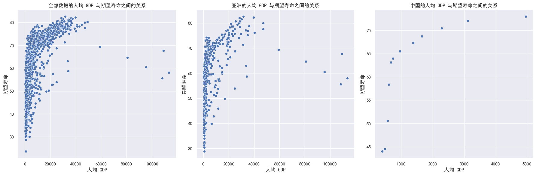
a) 请画图来显示人均gdp与期望寿命之间的关系,分别使用全部数据,一个洲和一个国家(例如中国)来展示
Python
# 导入需要的库和魔术命令
import pandas as pd
import matplotlib.pyplot as plt
import seaborn as sns
%matplotlib inline


# 读取数据集
df = pd.read_csv("gapminder.csv")
# 导入中文字体避免乱码
sns.set_theme(font = "SimHei")


# 创建子图
# 由于数据点较多且独立,采用散点图
fig, axes = plt.subplots(1, 3, figsize=(18, 6))


# 绘制全部数据
sns.scatterplot(data = df, x = "gdpPercap", y = "lifeExp", ax = axes[0])
axes[0].set_title('全部数据的人均 GDP 与期望寿命之间的关系')
axes[0].set_xlabel('人均 GDP')
axes[0].set_ylabel('期望寿命')


# 绘制一个洲
asia_data = df[df['continent'] == 'Asia']
sns.scatterplot(data = asia_data, x = "gdpPercap", y = "lifeExp", ax = axes[1])
axes[1].set_title("亚洲的人均 GDP 与期望寿命之间的关系")
axes[1].set_xlabel('人均 GDP')
axes[1].set_ylabel('期望寿命')


# 绘制一个国家(这里选择中国)
china_data = df[df['country'] == 'China']
sns.scatterplot(data = china_data, x = "gdpPercap", y = "lifeExp", ax = axes[2])
axes[2].set_title('中国的人均 GDP 与期望寿命之间的关系')
axes[2].set_xlabel('人均 GDP')
axes[2].set_ylabel('期望寿命')


# 调整子图之间的间距
plt.tight_layout()
plt.show()
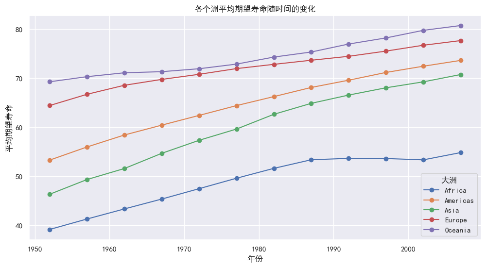
b) 请在一张图上显示各个洲平均期望寿命随时间的变化图
Python
# 创建一个新的图形
# 数据集中是多个面板数据,选择叠加折线图
plt.figure(figsize=(12, 6))

# 计算各个洲平均期望寿命随时间的变化
grouped_data = df.groupby(["year", "continent"])["lifeExp"].mean().unstack()

# 绘制各个洲平均期望寿命随时间的变化图
grouped_data.plot(kind = "line", marker = "o", ax = plt.gca())
plt.title("各个洲平均期望寿命随时间的变化")
plt.xlabel("年份")
plt.ylabel("平均期望寿命")
plt.legend(title = "大洲")
plt.grid(True)
plt.show()
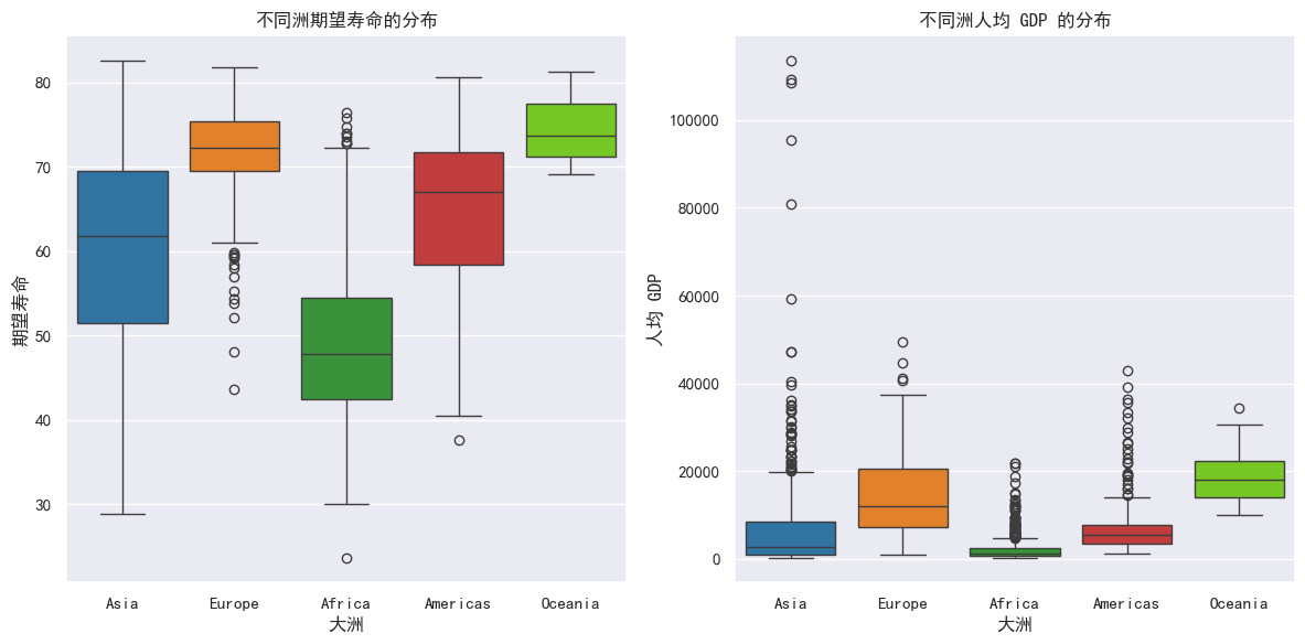
c) 请给出不同洲期望寿命和人均GDP的分布
Python
# 创建子图
fig, axes = plt.subplots(1, 2, figsize=(12, 6))
# 颜色列表
palette_color2 = ["#1f77b4", "#ff7f0e", "#2ca02c", "#d62728", "#77e20c"]


# 绘制不同洲期望寿命的箱线图
sns.boxplot(data = df, x = "continent", hue = "continent", y = "lifeExp", ax = axes[0], palette = palette_color2)
axes[0].set_title("不同洲期望寿命的分布")
axes[0].set_xlabel("大洲")
axes[0].set_ylabel("期望寿命")


# 绘制不同洲人均 GDP 的箱线图
sns.boxplot(data = df, x = "continent", hue = "continent", y = "gdpPercap", ax = axes[1], palette = palette_color2)
axes[1].set_title("不同洲人均 GDP 的分布")
axes[1].set_xlabel("大洲")
axes[1].set_ylabel("人均 GDP")


# 调整子图之间的间距
plt.tight_layout()
plt.show()